The Minimalist Booth: Why Less Is More in 2025

Sparks Marketing
A shift toward simplified, purposeful design and how it helps brands stand out in a crowded space.
In our modern age, overstimulation has become the norm. The real and digital worlds around us roar a constant barrage of noise, motion, messaging, and distraction, with little down time or relief. Nowhere is this intensity more concentrated than the trade show floor: beneath the glaring lights and the thrum of relentless activity, brands clamor for attention, digital screens beg for visibility, and conversations fight to be heard.
In such an oversaturated world, could the argument be made that in order to stand out, brands could consider standing back? Put another way: in a world that won’t stop shouting, is the smartest voice the one that speaks softly and with purpose?
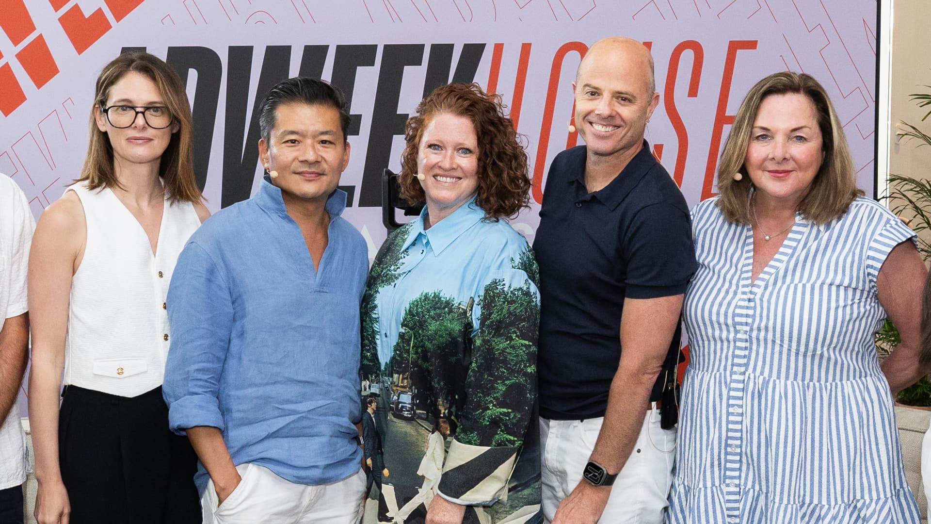
Sparks believes that less really can be more. Here are five key considerations every brand marketer should think about when designing their next trade show experience, from the perspectives of five of the brightest senior creative and design experts at Sparks.
1. Tighten Up Your Message (and Then Tighten It Even Further)
Before a floorplan has been drawn or a render considered, a ‘less is more’ approach will force marketers to land on a singular key message that will in turn inform the design of the entire space, and the experience had by the attendees. And as Vice President, Creative, Kambiz Ahmadi points out, this ‘less is more’ attitude goes far beyond just the messaging:
"A minimalist approach forces us as business managers, marketers, and creatives to boil down our messages to their most potent and effective form. For attendees, this saves time by reducing decision fatigue, as well as increasing message retention. And for brands, it allows the choice between reduced spend (fewer components, lower storage fees), or elevated executions (fewer components means higher quality touchpoints or engagements)."
It’s worth noting here a hard truth: ‘less is more’ thinking is often more challenging than simply filling your space with every message you want heard. But as you’ll come to see, this first step is critical to standing out from the crowd.
2. Less Is More Sophisticated
With a clear, dialed in message and marketing purpose, the process of creative design can begin in earnest. Vice President, Creative, Masaru Haruyama likes to consider the world of high-end retail as a jumping off point.
“High-end brands often lean into minimal design, which influences the perception of their quality and intent - look no further than Apple, and the experience of being in one of their retail stores. There is a perceived confidence and sophistication in these spaces, because simplicity is memorable: the details stand out, and therefore the content stands out.”
Minimalist design thinking provides intuitive access to information, avoiding clutter or overload: people are more likely to linger in spaces that are visually enjoyable and intuitively laid out. This was certainly the case in our CES Booth we designed for Siemens, which featured simple yet beautifully laid out case studies that featured compelling stories (told through the lens of their customers) showcasing how Siemens’ helps their clients achieve real-world improvements through their technologies to “transform the everyday, for everyone.”
3. Sweat the Details
In 1894, 19th century design polymath William Morris said "Have nothing in your houses that you do not know to be useful or believe to be beautiful.” Executive Creative Director, Bill Smith believes that this quote gets to the very heart of our ‘less is more’ approach, where attention to detail is absolutely essential.
“Less is more ultimately comes down to details: materials, finishes, furnishings and interactive engagements should be carefully considered and executed to ensure a limited yet high quality palette, with each element making a deliberate statement, and serving a clear purpose.”
As we noted above, dialling in a clear, singular message is challenging. But so is getting that message across cleanly and clearly, and paying attention to every design choice and interactive touchpoint is critical to making sure you stand out, and stay memorable.
Stephen Kellogg, VP Creative, Sparks
Minimalism goes beyond black and white; it’s simply a function of how you use color overall to achieve these goals.
4. Minimalism Isn't Always Black and White
Earlier, when Mas mentioned the design aesthetic of the Apple store, did your mind jump to reserved, open, predominately black and white spaces? While that is most certainly a trope of minimalist design, the principle of ‘less is more’ can also incorporate color, if used in clever and considered ways, argues Vice President, Creative, Stephen Kellogg.
“Color take-overs are a fun way to simplify environments, yet still be bold, modern, and minimalist. Minimalism goes beyond black and white; it’s simply a function of how you use color overall to achieve these goals. Tighten your palettes of color and materials to keep the visual impact and touchpoints purposeful.”
This approach informed the overall look and feel of the show floor at SAP Sapphire, which utilized this color en-masse approach to the entry sequence, the information zones in each of their Solution Areas, and also soft/social spaces like attendee lounges. It was a brilliant way to not only identify these zones through color, but also highlight a brand palette in a new and fresh way.
5. The Natural Order
Finally, when considering the hyper-stimulated nature of a trade show floor, standing out can mean offering your attendees an escape: a chance to step into an environment that feels removed from the chaos and clutter around it. Executive Creative Director, Christina Kellogg looks to natural environments for inspiration.
“Biophilic design principles are inclusive of a wide range of tactics, all of which ultimately ladder up to the core idea that humans are more productive, present, and calm when they feel connected to nature. Incorporating greenery has become a baseline environmental design complement not only for texture, privacy, or ambiance, but to promote a sense of comfort and calm in the experience which inherently increases one’s ability to relax, focus and take in information.”
A simple, intuitive experience is no accident. Some of the best-designed environments can often be ones that you don't think twice about — because every aspect of it has been designed in a way to suit your needs and facilitate a frictionless experience. So next time you need to stand out, remember: less really can be more.
For more expert insights and the latest trends in trade show marketing, check out resources like Trade Show Labs or Exhibit City News.